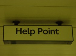
help point
if all goes wrong, climb on the ceiling:
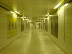
if all goes wrong, climb on the ceiling:


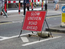
we’ve had this sign before, but it is a favourite, so we can have it again.
i always think that ‘uneven’ is odd
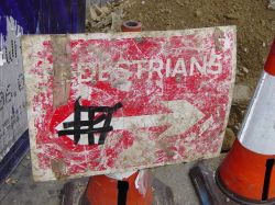
have you ever seen such a battered sign ?
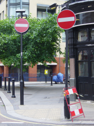
everything about this picture says no. the two no-entry signs. the no entry barrier and the yellow and black no entry tape attached to the barrier.
‘no no no’ they say. but i still walked on by.
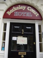
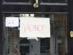
i suspect this isn’t the official ‘vacancy’ sign in this hotel. or maybe it is.
it makes you wonder what it’s like inside !
i have a degree in control engineering. one of the fundamentals (if i remember anything about it) is that systems converge or diverge. mostly you want things to converge so they are stable.
for example, you want air conditioning systems to converge on the target temperate.
unfortunately most British trains have divergent systems. you tell it what temperature would be nice for travellers to sit in. and it adjust to make it much colder on a cold day and much hotter on a hot day. it’s more of a question of extremes.
“pah” says the aircon, “you think this is hot ? do ya ? well, do ya ? i’ll show ya what hot is”. and so it goes.

UPDATE: my train on the way home was so hot the air conditioning broke and dripped water from the ceiling. it may have been condensation. it was in effect raining commuter sweat. escence of commuter. i should have bottled it.
i love a good ‘don’t chain your bike here’ sign. this has got to be one of the best. it’s a few metres up the road from this no bike parking sign
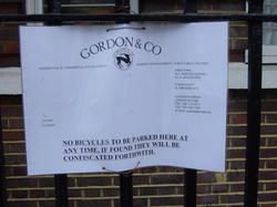
click to view the details
it’s nice to see people stepping outside of the 2D picture world. i have big plans to make this blog 3D.
watch this space.
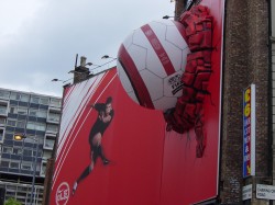
(actually i have no such plans, but it would be nice)
“these trousers have still got a hole in the knee. are you sure you mended them”
“yes sir”.
![]()
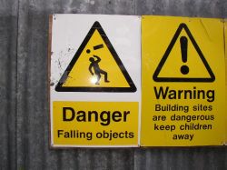
some of my favourite signs are ones that warn of falling material
this one was sent to me by our friend lynda. it’s very good.
i imagine this poor chap will go home and his wife will say “what’s that indentation on your head” ?
and he’ll say “it’s an exclamation mark”.
lynda is very keen on accurate spelling and punctuation so maybe it’s a home made sign giving me a gentle hint to get my english up betterlier.
it reminded me of this pre-blog picture of jane and a very little kezia. you probably haven’t seen it, so here you go:
we found this on the floor by our car this afternoon. i think the answer is quite bored. and seeing as it was a field used as a carpark for this day only, i’d probably also have been run over by a tractor.
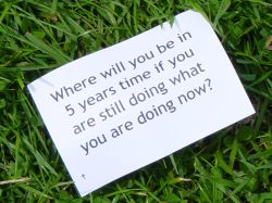
great font. ‘pub door sans serif’ i think

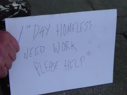
i paid the gentleman holding this sign 30 pence for a photo of his sign. he said “30 pence isn’t any good to me mate” which wasn’t very greatful. i gave him the money anyway. just in case you know.
it was a job he wanted and not money apparently. and it was his first day homeless. a cause for celebration perhaps.
i’ll go looking for him next week and see if he has incremented this sign or produced a new one. i may also get an update on how the 30 pence is going.
now, i’m in no position to pick people up on punctionation and spellling, but i did wonder why “winner” was in inverted commas. I suspect it’s because winning a hair and beauty contest isn’t really winning at all.
or maybe the nice judge said to the losers “don’t worry, we’re all winners here tonight” and they took it literally ?

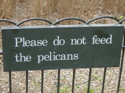
sing from st james’ park
“if you’ve nothing to say, then say nothing”.
How i’ve wished to shout these words at particularly boring characters in excruciatingly tedious meetings.
instead i scream at them in my mind.

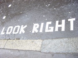
it’s important to look right. if you don’t look right, chances are you’ll look wrong and it’s times like that when you ought to take a long hard look at yourself and see yourself as others see you. see ?
i’m not sure if i like the font they are using here. I think it’s RoadType Sans Serif.
pete sent me this sign. he’s done very well as it’s a great sign. it would have been even better if they had spelt weekdays as ‘weak days’ to celebrate old people’s frailty.

little children are very tricky when it comes to toilets. their response to needing the toilet is quite binary (they need it desperately or not at all). The waving the arms in the air thing is quite typical at the desperate stage.
this sign is very reflective of the moment:

and here is a drinking fountain which is lacking some ooomph. or perhaps the person needs to bend over a bit more:

it’s not completely out of use. it still makes a nice flag with writing on type thing.
