Skip to content

signs (handwritten)

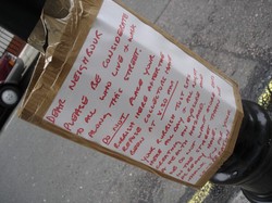
paper persons required

080419_850_img_8044.jpg

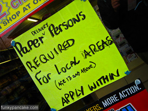
i like this sign.  i especially like how they’ve clarified it’s not actually paper persons they need, it’s people delivery persons.  just so you don’t get confused. 

it’s also interesting that they changed the word ‘deliverys’ to areas.  probably to avoid a spelling amiguity. 

i do that myself – whenever i try to write scared i never know whether i’ve written scarred (or vice versa – still not sure) so write ‘worried’ instead.

possibly broken

this sign was on drinks machine, which may be broken. or it might be mended, in which case remove the sign.
070920_850_img_5115.jpg

long sign, but not quite long enough

070809_850_img_4228.jpg
i like this sign. obviously huge amount of work has gone in to writing it with letter stencils, but you would have thought they would have made sure they had enough space for the last word !
070809_850_img_4229.jpg

charitable directions

070703_350d_img_0384.jpg
i spoke to the chap who wrote this sign and he told me he’d raised £700 for the hospital which was quite fantastic.
i asked him if his answers related to geographic or spiritual lost-ness. he said it was solely geographic lost-ness. rather than soul-y lost-ness i assume.

faulty

i love the word faulty. it’s a good ‘un.
070203_850_img_0716.jpg

angry neighbour

a sign appears in this street about once a year asking neighbours to not leave their rubbish out. i just love the effort that must go in to creating these signs.
https://www.funkypancake.com/blog/stuff3/2006/05/DSC09659-thumb.jpg