fashion victim
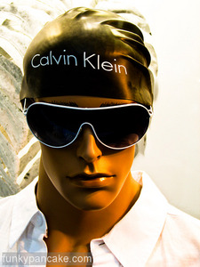
nice swim hat
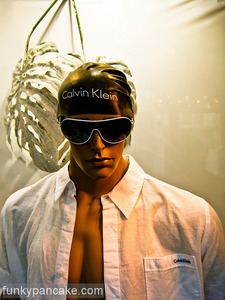
nice swim hat
for ages our girls referred to McDonalds as a restaurant. which i suppose it is. still was cute though. ‘daddy took us to a restaurant for a happy meal’.
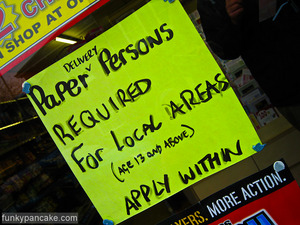
i like this sign. i especially like how they’ve clarified it’s not actually paper persons they need, it’s people delivery persons. just so you don’t get confused.
it’s also interesting that they changed the word ‘deliverys’ to areas. probably to avoid a spelling amiguity.
i do that myself – whenever i try to write scared i never know whether i’ve written scarred (or vice versa – still not sure) so write ‘worried’ instead.
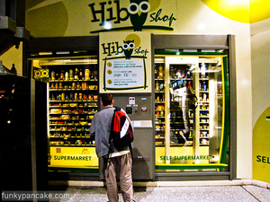
i’ve no idea why the thumbnail above is so big.
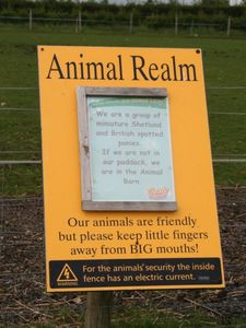
keep little fingers away from BIG mouths
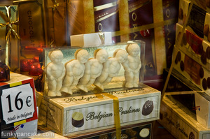
still no chocs for me since last october ! (still just as much a nightmare as the day i gave up though)

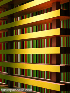
i like the expectation of the yellow one above.

and this very apologetic door called leon who loves us

and this slightly vague one, which at least suggests we don’t use the window.
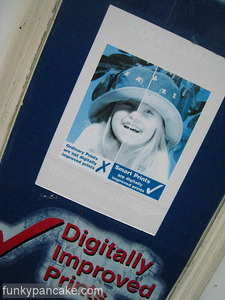
i saw this outside a photo shop – it’s a classic advertising picture which is usually in glorious colour with the version on the right hand side better exposed by the people who run the shop proving they have the technology skills to digitally improve your shots.
only this advert obviously spends a lot of its time in direct sunlight and has faded to just blue. not a great advert.